TrailTech
Enhancing the browsing-to-checkout conversion rate. Demonstrating the impact of a compare rack feature lowing cart abandonment rate.
Project Overview
Introduction & Problem
TrailTech is an e-commerce site created to be mainly used by high income earners who take biking seriously and are looking to make an investment in the right bike with the right features.
The problem the TrailTech team was noticed with their previous web design was that about 50% of users open 7 item pages before abandoning site without moving anything to their cart. They also noticed that 70% of users who do put items in their cart abandon at the registration phase.
Objective
Research how users determine which bikes are best for them, what features they are comparing, and what is the best way to display that information
Validate if the addition of a guest checkout would increase conversion
Test if the addition of a compare feature would allow the user to make sure the items they are putting in their cart are the items they want to purchase, therefore increasing conversion from the cart
Discovery
Secondary Research
I explored what users look for and compare when shopping for bikes, and investigated why e-commerce shoppers abandon their carts at checkout
What are bikers wanting to compare?
Types of bikes
Price
Colors
Ratings
Description
Full suspension, hardtail, no suspension
Carbon vs. aluminum
Frame
Rim
Tire
User Personas
Why do users abandon their cart?
The absence of a guest checkout option
An inconvenient and lengthy checkout process
Lack of some payment methods
Hidden extra costs
With this information I now understood what my users were wanting to see and compare. I also wanted to test out if a one page checkout design would increase conversion.
I created two user personas to empathize with users who were trying to find a specific bike, as well as users who wanted a quick checkout with as minimal steps as possible.
Competitive Analysis
I conducted a competitive analysis using two well-known bike sites and a popular e-commerce site. This led to design goals like comparison tools and highlighted differences between general and specialized sites.
Define
User Flows
Sketches
Why start from scratch when you can build upon existing strengths? Leveraging insights gleaned from my competitive analysis, I strategically integrated elements of the UI that resonated with users, infusing my sketches with the same user-centric appeal. This approach not only streamlines development but also ensures that our design aligns closely with proven industry standards and user preferences.
Wireframes
Guerilla Testing Wireframes
I tested 6 different people to see how they navigated the site and if they would use the compare feature.
When I asked users why they add items to their cart in any e-commerce experience they all said pretty much the same thing.. The item looks interesting and “I want to save it so I can compare it to other items or on other sites” or they added it because they were ready to buy. By having a compare feature on the website, I think this will eliminate a lot of users adding items to their cart simply to compare.
UI Feedback
From this testing it clicked in my head:
The Compare Rack page will work somewhat as a “cart” placeholder for those users who typically add items to their cart to compare.
Users would like to see a stronger CTA on the item compare feature
Users would like to see a short description with features along with price and color on the initial browsing page.
On the add to cart page, users would like to see the ‘buy’ CTA moved closer to the price
Design
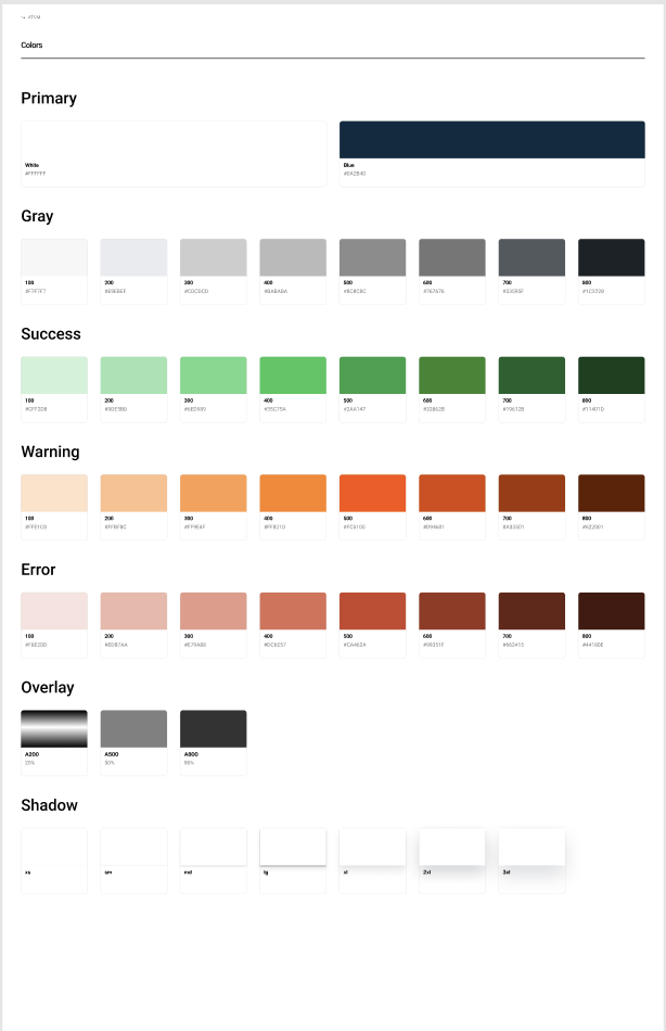
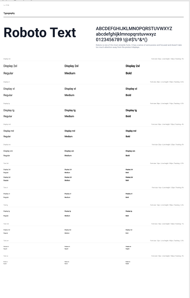
Style Guide
I chose colors and type that would display a more serious side to the brand.
High Fidelity Mockups
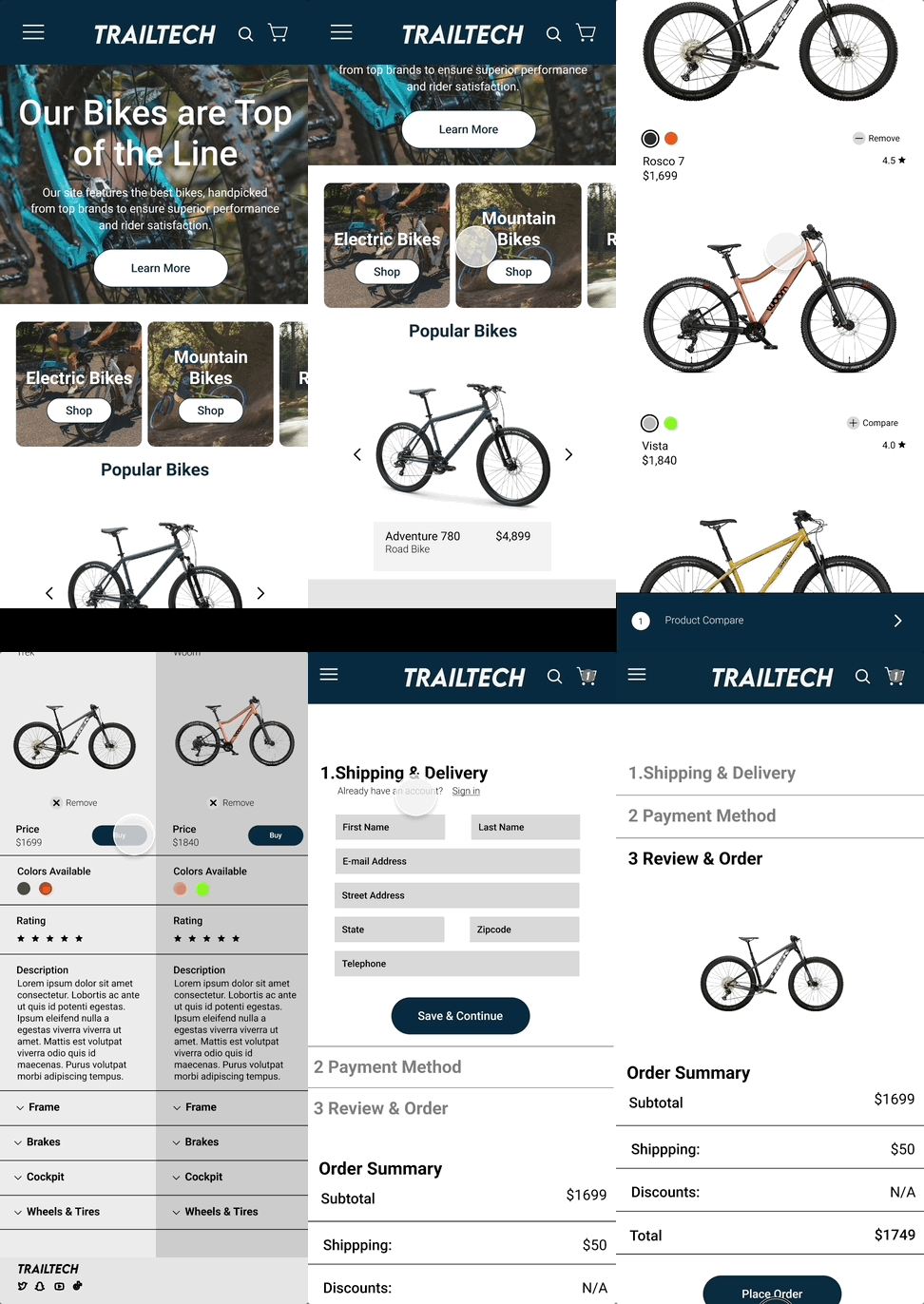
Using what I learned from my guerilla testing, I added a hover description to the bikes, changed the compare CTA and moved the ‘Buy’ button on the checkout page
Then I implimented my style guide and created the rest of my mockups
Usability Testing with High Fidelity Mockups
When asked if having a compare rack feature to place items in while shopping, most users said they would use this feature instead of adding items to cart for comparison, thus increasing cart conversion.
All users stated that a guest checkout is much more convenient, and having an express pay is expected now a days.
UI Feedback
The product compare tab was almost missed because it blended in
When testing the high fidelity mockups users like the addition ‘Popular bike’ said they usually filter e-commerce sites through what is popular.
Users said they’d like to see a ratings on the initial screen
High Fidelity Edits
Based on user feedback, I changed the ‘Compare’ feature to the blue so it would stand out more, I also added a search by popular feature to the hamburger menu
Prototype
Mountain Bike Page Edit
Most popular filter was added sine users said this was how they mostly shopped on e-commerce sites
Ratings were added to the photo
The compare CTA was changed to add more contrast
Before
After
New Menu
Learnings
What I learned..
Working on this TrailTech project, I gained valuable insights into the e-commerce sector and the pivotal role of Key Performance Indicators (KPIs) in validating design choices. Through iterative testing, I learned to implement findings derived from user testing to inform the next rounds of design enhancements. This experience underscored the importance of user feedback and data-driven decision-making in crafting effective user experiences within the digital commerce landscape.
Furutre Iterations..
In the future I think it’s definitely a benefit to TrailTech and any e-commerce site to have autofill and express pay as a part of any checkout. I would like to add a feature to finding the right size, and flow out maybe more of the searching by popularity.


