Play Forever
Redesigning for Impact: Crafting a cohesive website and design system to boost non-profit partnerships
Introduction & Objective
Play Forever, a non-profit supporting the greater Toronto area with recreation, education, and mental health services, primarily uses Instagram for program signups and sponsorship contact. The goal was to enhance their website to better showcase their work, connect with sponsors, and capture emails for future newsletters.
We aimed to design a website that builds trust, reinforces value, and enhances credibility, focusing mainly on the home and partnership pages. Our goals included:
Highlighting the mission statement
Sharing testimonies
Creating a clear email signup for newsletters
Showcasing sponsor impact with statistics, stories, and images
Timeline & Scope
With just 4 weeks to complete the project, I created a scope and timeline, delegated tasks, and ensured mutual support. We held weekly Zoom meetings with the Play Forever team and sent mockups for feedback along the way.
Discovery
Evaluation of Current Site
Solutions
Competitive Analysis
Based on our analysis of the site evaluation, we came up with clear solutions we could offer Play Forever
Clarify the Mission and Vision of PF: Transform user experience by articulating a clear, inspiring mission and vision, ensuring visitors understand and connect with PF's purpose and direction
Enhance Emotional Connection: Deepen engagement by sharing a compelling, heartfelt story that builds trust and forges a strong emotional bond with our audience.
Smooth User Experience: Elevate user satisfaction by fixing all broken links and buttons, creating a seamless and frustration-free interaction that keeps visitors engaged.
Simplify Task Completion: Make navigating the site a breeze by creating intuitive, clear pathways for completing tasks, such as contacting PF, ensuring users have a smooth and efficient experience.
To get familiar with non-profit sites and gather some UI inspiration, we found industry examples and marked what we worked and didn’t work in each.
Affinity Mapping
We created an affinity map to organize our research and analysis of the current site. This helped us understand and visualize how users are interacting with the site.
Conceptualize
Creating Empathy
Focusing on partnership generation and newsletter sign-ups, we crafted "How Might We" statements and personas for empathy, then designed user navigation flows.
User Persona
We developed Rachel to represent the main users of the site. By referring to Rachel in meetings, we ensured our design decisions consistently aligned with the needs and preferences of our end users
Design & Test
New User Flows
Thinking about some of the disorganization of the previous site and our goals, we knew we needed to create an architecture that would have a way to get in contact with Play Forever on every page.
Sketching
Using Figjam, my partner and I collaborated on the essential elements to include, annotating each component. Drawing inspiration from our competitive analysis, we aimed to create a clear, visually-driven design with a strong emphasis on graphics and images to evoke an emotional response.
Based on our research and competitive analysis, we assumed that potential partners visiting the site would be interested in visualizing what a partnership with us would entail
Wireframes
Guerilla Testing with Wireframes
Over two days, we tested three users, including two UX professionals, navigating wireframe scenarios to evaluate our user flows.
Objectives
The goal of the test was to see if the wireframes and flow we’ve designed so far provide a smooth and seamless experience for users to:
Contact Play Forever about a sponsorship opportunity
Sign up for the newsletter
Testing Results
Issue #1
The newsletter signup pop-up on the homepage is both ineffective and irritating to our users.
Possible Fix
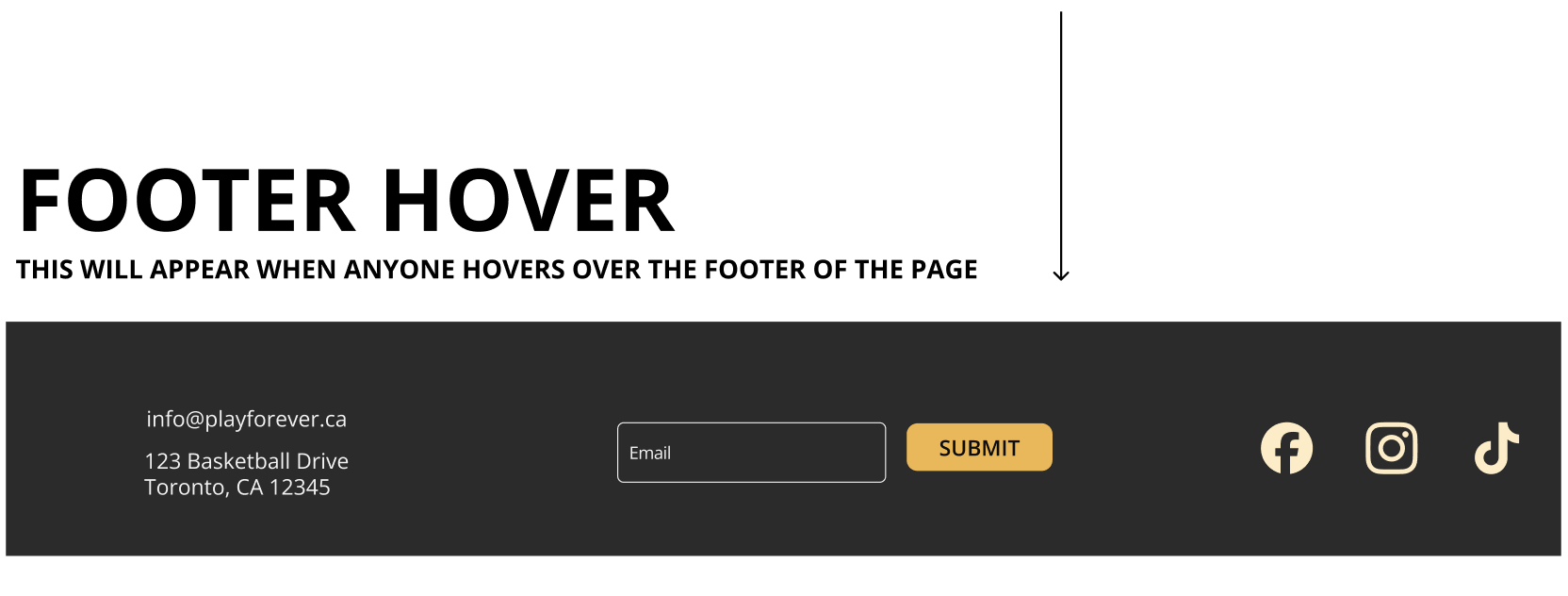
We should remove the newsletter pop-up and create a less intrusive but still easily accessible way to invite users to sign up for the newsletter–perhaps a header drop-down?
Issue #2
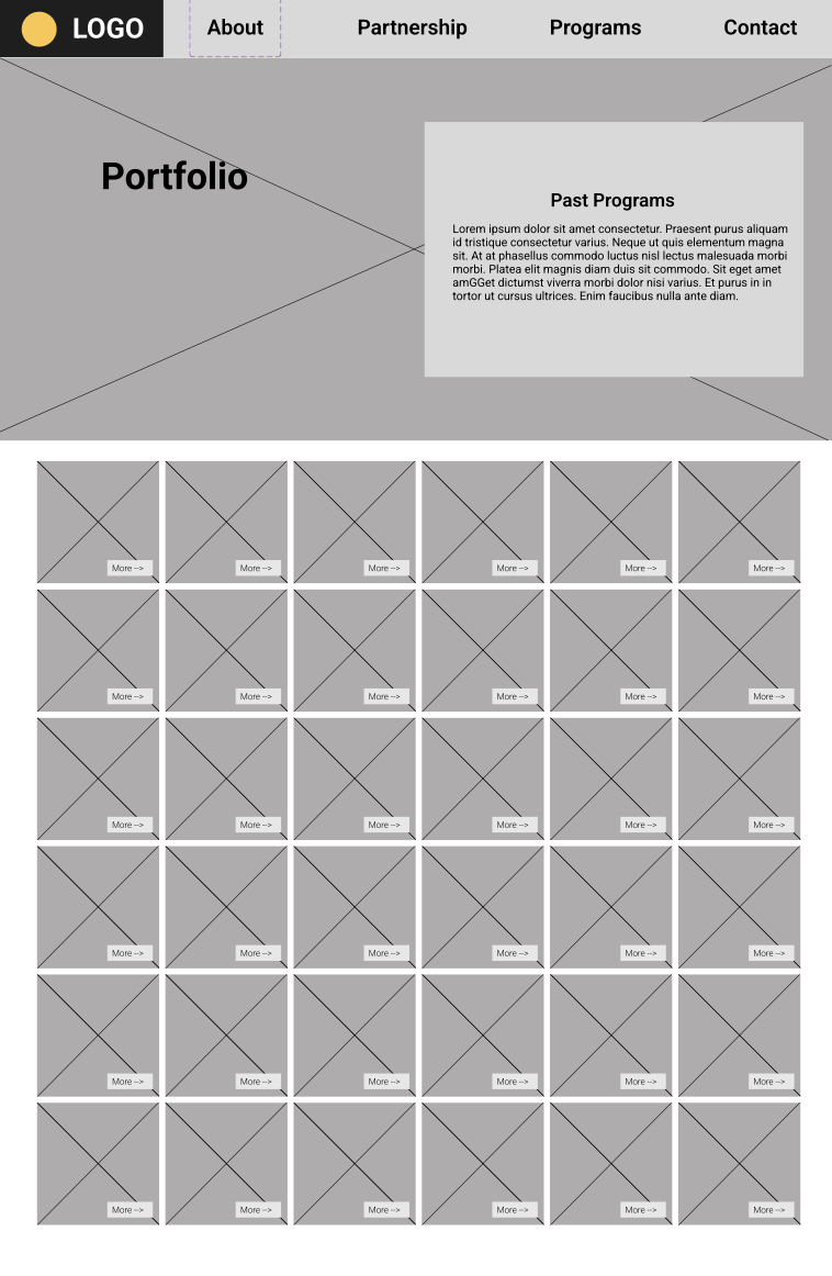
The Programs pages are confusing to navigate and don’t showcase past/current programs well.
Possible Fix
We should further develop the two programs pages to clearly present both past and current programming. For past programming, we should display programs in a way that is more inviting and streamlined (less overwhelming).
Design System
High Fidelity Designs
Final Edits
We noticed the original website colors clashed so we used this opportunity to create a thoughtful and consistent visual design . Knowing the Play Forever team lacked development resources at the time, I designed a clear, transferable system using their logo colors and complementary gray
High Fidelity Usability Testing
click to see full version
Once we shared the high fidelity mock ups with the client, we explained our next step was to test users to get the most accurate feedback, it would work best if we had actual users or subject matter experts. They were unable to give us any resources for testing.
We tested three different users. All provided excellent feedback from different perspectives.
User 1 had great familiarity with non-profit work and websites
User 2 works in the UX field on government sites
User 3 comes from a business and marketing background.
Findings
Users felt it was important to quickly understand sponsorship details.
We emphasized during the wrap up meeting just how important compelling and real copy can be to let users know who Play Forever is.
Future testing should be done with real users.
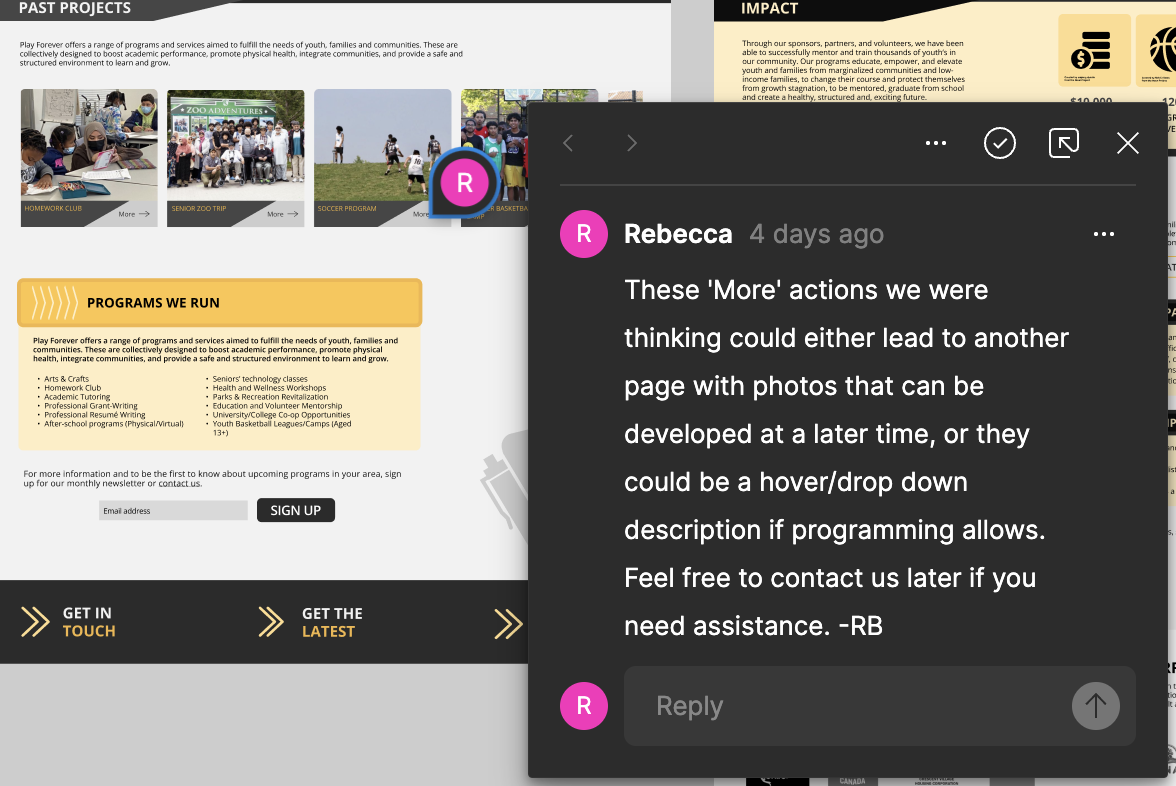
We offered suggestions for developers and left the contact open for how to design these ‘more’ actions on the Programs page.
Challenges & Learnings
Recommendations for next steps
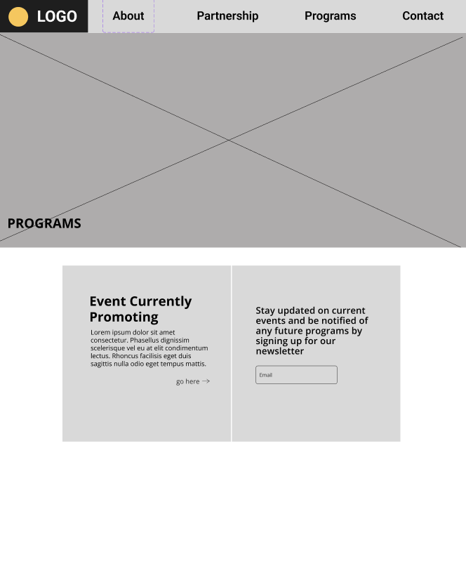
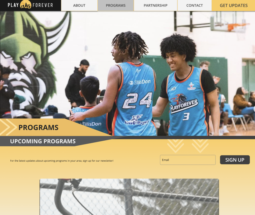
Right here is when the idea came about for the programs page to be divided into two sections;
a portfolio of past programs to show the work that had been done
as well as a way to sign up for the newsletter to follow upcoming events
After our testing with the wireframes we strived to create a more clear hierarchy. Using our design system and some graphics we came up with less overwhelming display.
Our goal was to have multiple CTA’s on each page that would take you to the contact or sign up for the newsletter.
click here to see full script
Issue 1: Newsletter signup CTA is not compelling enough
Users found signing up for the newsletter easy and liked its placement on the navigation bar
Some users were unclear about the content of the newsletter and felt that the term 'Updates' implied notifications rather than a newsletter; additionally, most users expressed a preference to avoid receiving spam emails
Issue 2: Confusion on Upcoming Programs
Users expected a calendar of future events to be under the upcoming programs tab, or a way to sign up. The Play Forever team did not have access to upcoming program calendar, or events instead they wanted users to sign up for the newsletter to find out about events.
It’s became clear to us that we need to re-visit the idea of having an ‘Upcoming’ programs tab if there isn’t any way to actually sign up for the programs
Issue 3: Two CTAs on Partnership page causes confusion
Having two CTA buttons, essentially leading to the same place created confusion with users
During this round of testing, having the CTA so low on the page was not as helpful since the main goal of the page is for somebody who wants to reach out
we used more descriptive language of what the newsletter would actually include since in our research people were more inclined to sign up if they know exactly what they’re signing up for
we also adjusted that language in our header sign up
We added a corporate sponsor testimonial to relate more to the potential new sponsors
They wanted to see the Play Forever leadership, emphasizing its diversity and youth to connect emotionally with potential sponsors.
We encountered a few challenges mostly due to limited client resources
The absence of a newsletter which posed difficulties in encouraging sign-ups
Our content pool was restricted to their existing website and Instagram profiles
Ideal testing conditions would have involved real user feedback or subject matter expert interviews, we maximized our resources to the best of our abilities
Prototype
Our main problem to fix on the Partnerships page was to split that double CTA up. We moved one above the fold, but used less committal language
Wrap Up
We had our final wrap up meeting with the founder, where we went over our test findings and final prototype and asked for feedback.
Since we never received copy or pictures for the pages, we used AI text to fill in some key paragraphs like the ‘Who We Are’, and what partners can give and receive on the Partnership page, also the images for the leadership on the About page.
During the wrap up call it was brought to our attention that there needed to be an area for the Annual reports. Wing Yun and I designed a section for them on the home page
Collaborating closely with my partner was a highlight, I excel in team environments and appreciated the role of team lead, particularly in managing organization and coordination across time zones. This experience provided valuable insights into managing client expectations and navigating the UX process from their perspective, emphasizing the importance of effective communication and understanding limitations
click to see full prototype


